Best Law Firm Landing pages to grow your practice
You’ve spent a lot of time — and money — creating a beautiful website that gets tons of traffic, but no one is calling you to schedule a consultation or to hire you. Your problem may be that you don’t have optimized law firm landing pages.
A landing page is a page with the goal of making the user take some action. It’s a powerful tool to grow your practice if you use it strategically.
Landing pages are a page with any kind of content and one call to action linked to the piece. This call to action is related to the goal for this particular page, which depends on the bigger goal of the strategy. Each page should have only one call to action.
For every goal, there’s a proper landing page. In the legal field, some examples are the “about us” page, the page to schedule consultations, or the” contact us page”. All of them are important in a digital marketing strategy.
Elements of good law firm landing pages
A killer headline
The headline is the title of your page and a good headline determines if people will read the rest of the page or not.
A good headline will tell the visitor what they’ll get from the page. So, if you are creating the landing page for a “What to do if you get pulled over for a traffic stop” webinar, for example, you shouldn’t make it “Welcome to the Law Firm”, a good landing page would have on the headline something like “Register now to learn what to do if you get pulled over for a traffic stop.”

A clear call to action
A call to action is a button that holds the intention of the page. It has to be clear and to the point.
Back to the above example, the call to action would be something like “register now”. Calls to action shouldn’t be ambiguous, a good call to action is clear. They have to be actionable.
Design
Good page design is critical because most people don’t read, they scan.
To optimize your conversions you should consider the reading pattern of people on the internet:
- People focus first on the top-left words, with an F reading pattern
- Most people read only 28% of the text before they leave
- Use your call to action multiple times (no less than three) so people don’t have to scroll all the way through the only button on the page
Mobile friendly
Having a website that’s mobile-friendly means it’s optimized for mobile devices, like cell phones. All the images and text should fit perfectly on the mobile device screen and also all the functions should work properly.
At least 70% of visitors come by mobile devices and will bounce off a page that’s not mobile-friendly. As a result, you’ll lose a lot of conversions.
Test, test, test
There’s no one-size-fits-all solution to creating a good landing page, you’ll have to test every element of it separately and then all together always keeping in mind that a landing page that drives a lot of conversions is built with all these elements but with tweaks for your specific circumstance.
Examples of good law firm landing pages
We assembled some examples of how some law firms are using landing pages in their websites.
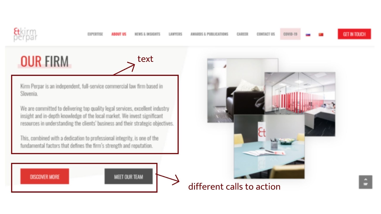
- Kim Perpar’s webpage: what we like about it is that their text is short and to the point. However, we recommend using one single call to action on each page and using a color that stands alone on the page to the button.
- Cohen & Jaffe: They have a headline that clearly states their positioning and the text is organized in a way that is easier for the reader to read it. They also have two different calls to action, even though they are related.

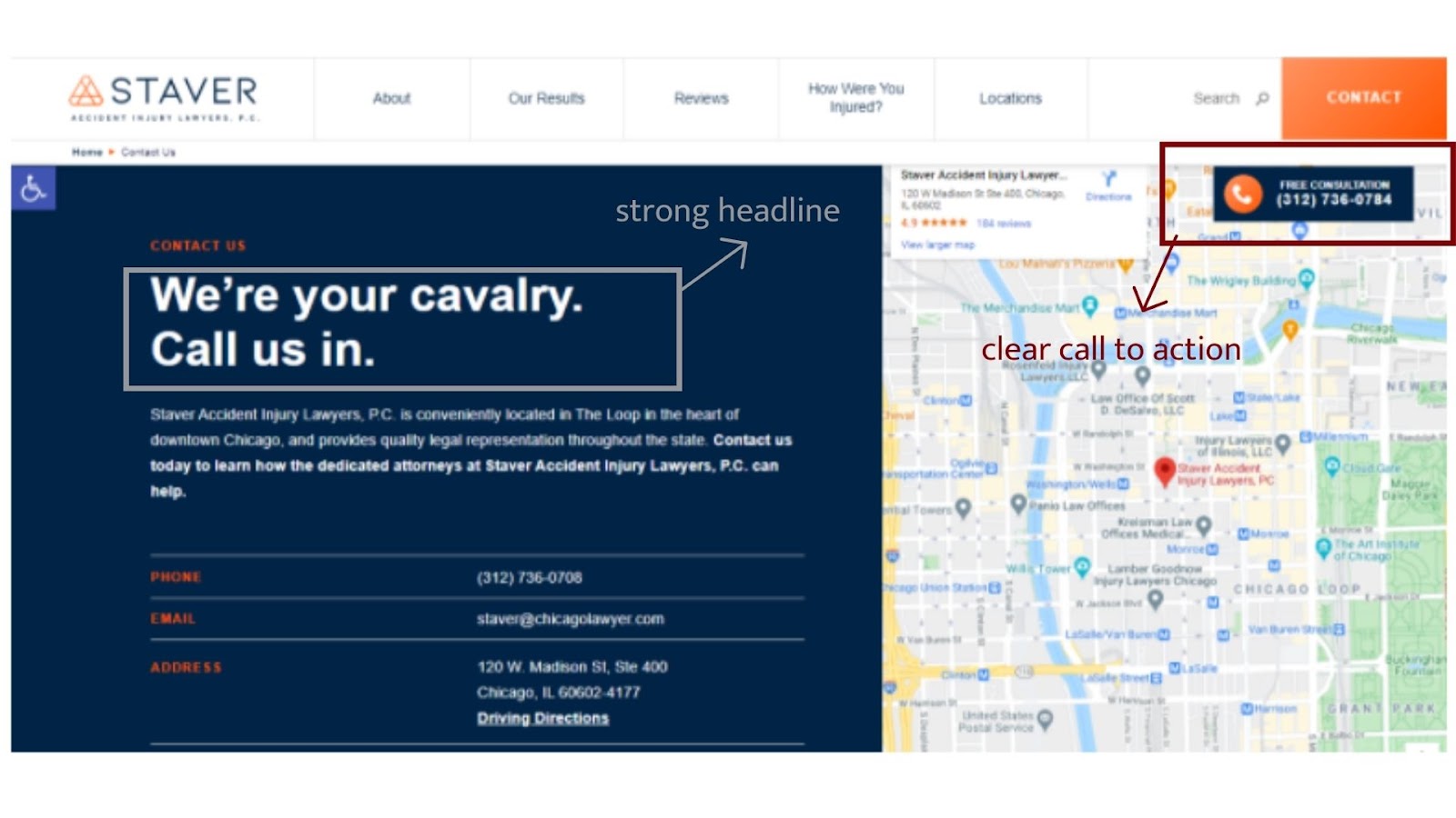
- Staver: we like their strong headline and they have a clear call to action that is repeated multiple times, you can call them, send an email and even go to their law firm address.
Successful landing pages are built upon both strategy and test and a good landing page will help you achieve your goals for sure.
If you’d like to learn more about building optimized law firm websites, read our blog post on it here. Or talk to us here.